Case Study — Brand Identity · 2025
Lumen Skincare
A complete identity and packaging system for a botanical skincare line, built around restraint and ritual — designed to hold its own next to heritage luxury on a crowded shelf.
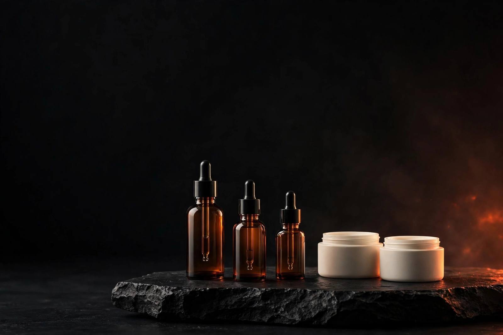
Overview
Lumen is a botanical skincare line built on a simple conviction: fewer, better products, made with unusual care. Skillsquad was brought in before launch to give that conviction a visual voice — an identity and packaging system designed to stand beside heritage luxury while signalling a modern, ingredient-led philosophy.
The engagement covered naming refinement, primary and secondary identity, a six-SKU packaging system, launch art direction and a foundational brand book. Every decision was tested against one question: would this survive a crowded shelf, a customer flat-lay, and someone's hand at six in the morning? The answer became the system.
The Challenge
The founding team had formulations they believed in and a name they loved, but no visual identity to carry either. Early drafts leaned on generic clean-beauty tropes — thin green leaves, watercolour washes, lowercase everything — and the brand was disappearing into a sea of sameness before it had even launched.
The deeper problem was tonal: Lumen needed to feel both botanical and clinical, warm and precise. Shoppers in this category read ingredient lists and distrust hype in equal measure. The identity had to earn trust in three seconds on a shelf and reward a slower look in the hand.
Strategy
Positioning: the modern apothecary. We anchored Lumen not in "natural" clichés but in ritual — the deliberate, daily ceremony of care. Restraint became the luxury signal: fewer words on pack, more confidence in the type, space used as a material rather than emptiness.
Commercially, the system was designed for the shelfie era. Packaging that photographs beautifully in flat-lays, reads at thumbnail size, and feels substantial unboxed. We defined three audiences — the ingredient reader, the design literate, the gifter — and tuned the hierarchy so each found their way in within seconds.
Restraint is the luxury signal. Space is a material, not emptiness.
Creative Direction
Direction: dawn light on stone. A palette of warm paper, deep ink and a single sage tint; hairline rules that behave like breath marks; typography that speaks quietly and exactly. References: Japanese stationery, apothecary glassware, modernist book covers — objects that reward handling.
Photography direction paired soft directional light with botanical macro and water, shot at one restrained angle so the feed reads as a single continuous ritual. Nothing glossy, nothing loud — the confidence of a brand that doesn't need to shout.
Design System
- Ink
#0A0A0B - Paper
#F4F3EF - Amber — seals only
#FDB813 - Sage — project tint
#A3B899
- Display — Space Grotesk. Tight tracking (−3%), pack fronts and headlines. Speaks quietly, exactly.
- Body — Inter. 1.65 line height for ingredient lists and long-form reading.
- Hierarchy rule — brand, then product, then ritual step. Never all three at the same size.
- Packaging grid12-column pack grid with a 24pt safe zone; hairline rules held at exactly 1pt across all substrates.
- Ritual numberingEach SKU carries a roman numeral marking its step in the routine — the system teaches the ritual.
- Seal systemAmber seals are rationed to limited editions and press samples, so they keep their charge.
- Motion easingLaunch films crossfade with ease-out-expo at 800ms — photography never cuts, it breathes.
Final Execution
The system shipped as a complete launch toolkit — formulation to shelf without a second agency pass. Print, photography direction and templates were built from the same grid so the brand never fragments as it grows.
- Primary + secondary marks and monogram
- Six-SKU packaging system, print-ready
- Shipping mailer, tissue and seals
- Launch photography art direction
- 40+ social and e-commerce templates
- 48-page brand book and usage rules
Results
Results are measured against client KPIs and published with permission — for Lumen, sell-through, repeat purchase and branded search from launch week onward.
The identity was designed to make Lumen photographable, giftable and unmistakable on the shelf: the conditions under which a young skincare brand earns its second purchase.
Awaiting verified results
Your Move
HAVE AN IDEA?
LET'S MAKE IT UNMISSABLE.
Whether you're launching a brand, redesigning your digital presence or creating content that demands attention — let's build something remarkable.