Case Study — Packaging · 2024
Verde Organics
Shelf-dominating packaging for an organic range — oversized type, deep green fields and the confidence to be the loudest thing in the aisle.
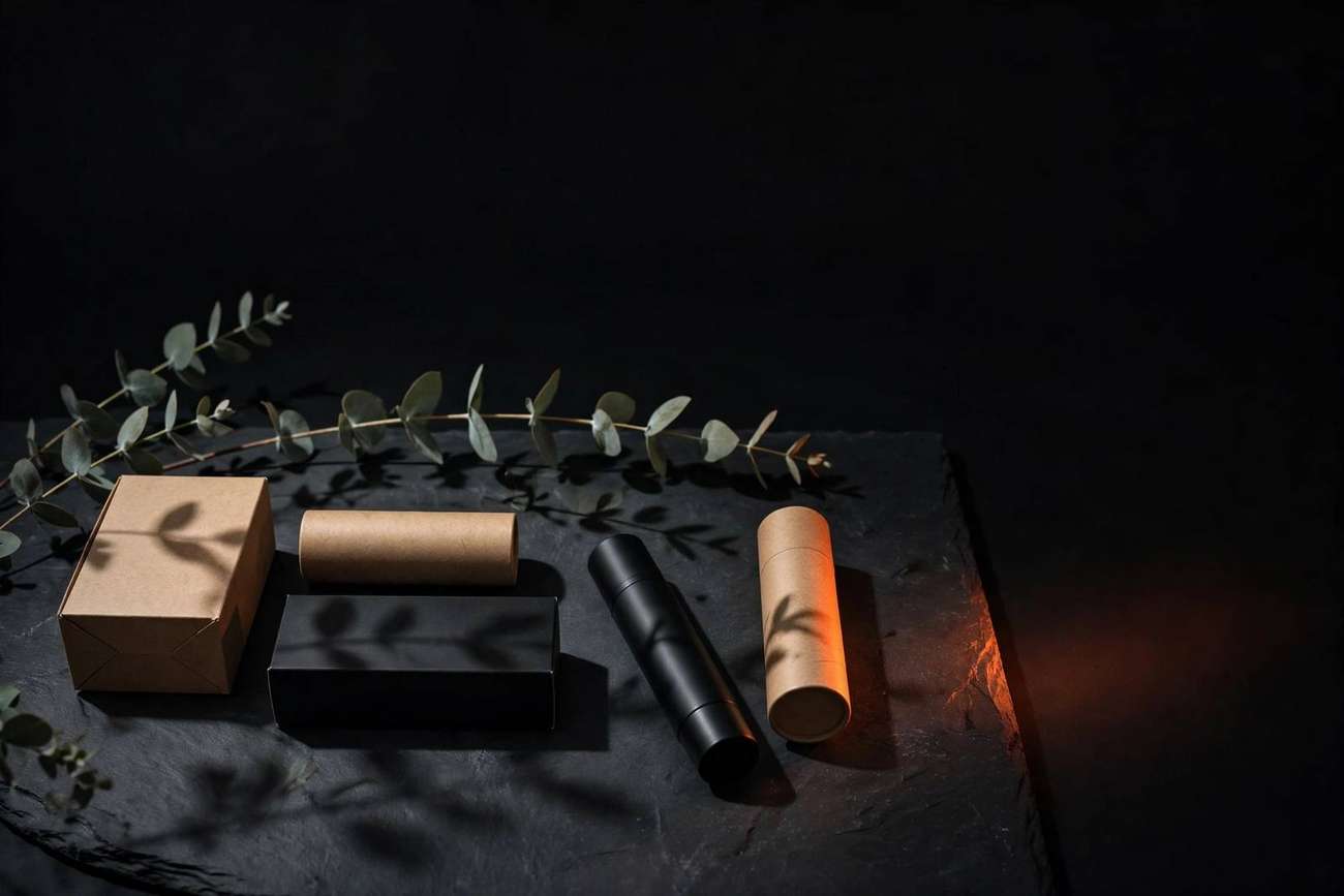
Overview
Verde makes organic pantry staples with honest sourcing and no shortcuts — and was losing the shelf to brands with weaker products and louder packs. Skillsquad redesigned the full range: pack structure, illustration, typography and a back-panel system that treats the ingredient list as a feature, not a legal requirement.
The engagement covered eight SKUs, dielines and print production, shelf renders for buyer meetings, and art direction for the range's retail debut. The brief was blunt: make the product findable from ten feet and delightful from ten inches.
The Challenge
The organic aisle is a paradox: everything claims to be natural, so nothing looks natural. Verde's old packs used the same muted kraft-and-leaf language as every competitor — and read as own-label next to the confident national brands.
The range also had to survive two distances. From ten feet, a shopper must spot the brand; from ten inches, a sceptic must trust it. Most packaging solves one distance and fails the other. Verde needed both, on a timeline set by a retail listing window.
Strategy
Strategy: botanical brutalism. Instead of whispering "natural" like the rest of the aisle, Verde would own the shelf with oversized type on deep green fields — one confident produce illustration per SKU, nothing decorative, nothing apologetic. Where competitors used thirty words, Verde used three.
Variants were colour-blocked so the range reads as a family from across the store, and the back panel was redesigned around radical honesty: big type for what matters, the full ingredient story for the sceptics, and sourcing claims kept short enough to be believed.
On a crowded shelf, confidence is the loudest colour.
Creative Direction
Direction: the produce crate, modernised. Matte stock with a tactile finish, embossed marks you find with your fingers, and typography set like signage rather than labels. References came from vintage seed packets, produce crates and botanical plates — honest graphics from before marketing existed.
Each SKU carries a single hand-drawn produce illustration, scaled large and cropped tight, so the range feels like a harvest rather than a product line. The emboss catches the aisle light; the matte keeps it grounded. Premium you feel before you read.
Design System
- Ink
#0A0A0B - Paper
#F4F3EF - Amber — seals only
#FDB813 - Leaf — project tint
#6FA356
- Display — Space Grotesk Bold. Oversized, tight tracking, signage-scale. The product name is the headline.
- Body — Inter. For back panels and legal — honest information set with the same care as the front.
- Three-word rule — the front of pack makes its point in three words or fewer.
- Dieline gridA shared structural grid across all eight SKUs — one system, scaled to every pack size.
- Variant colour-blockingEach variant owns a green depth; the range reads as a family from across the aisle.
- Back-panel hierarchyWhat matters in big type, the full story below it, claims short enough to be believed.
- Print specificationMatte laminate with embossed marks — premium felt in the hand, not just seen.
Final Execution
The range shipped print-ready with dielines, shelf renders for buyer presentations, and a retailer deck that sold the story before the product hit the pallet. Art direction extended to launch photography so the digital shelf matched the physical one.
- Eight SKU pack fronts, print-ready
- Dielines and production files
- Shelf renders for buyer meetings
- Brand applications and retail deck
- Launch photography art direction
- Packaging art direction guide
Results
Results are measured against client KPIs and published with permission. For Verde, that means retail sell-through, listing expansion and unaided shelf recognition — tracked from the range relaunch.
The packaging was designed to win twice: findable from ten feet, trustworthy from ten inches — the two distances that decide whether a pack leaves the shelf.
Awaiting verified results
Your Move
HAVE AN IDEA?
LET'S MAKE IT UNMISSABLE.
Whether you're launching a brand, redesigning your digital presence or creating content that demands attention — let's build something remarkable.